Posts

Showing posts from January, 2010

Making marks

Image
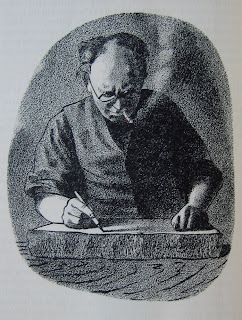
Since I last posted about Barnett and Claudia Freedman, I have found out a bit more about Barnett Freedman, and acquired some more of his work. Barnett Freedman is I think underestimated as an artist, precisely because of the thing that makes him most interesting, which is his devotion to lithography as a means of mass distribution of original fine art. He was not really interested in producing signed limited editions of 20 prints for connoisseurs. As he argues in his article �Autolithography or Substitute Works of Art� in The Penrose Annual in 1950: �While limited editions of hand-pulled proofs account for most of their work to date, autolithography specifically planned for machine production is�in the opinion of the present writer�the real sphere for the future activities of artists who are prepared to overcome the difficulties of working in close co-operation with publishers and printing houses.� Barnett Freedman, Self-portrait at the lithographic stone Drawing, 1938 Barnett Freedm...

Oakey's waterproof flint paper

Image
What on earth kind of print can be on the other side of this? Oakey's Waterproof Flint Paper, made expressly for wet-rubbing-down by Wellington Mills, London? The answer is a stencilled intepretation of an untitled painting by Joan Mir�. It is printed on this extraordinary sandpaper support because that is what Mir� himself had used for the original. The artist responsible for the stencil was John Piper. Piper recalls this episode in "Working with Printers", written in 1987 for Orde Levinson's catalogue raisonn�, "Quality and Experiment": The Prints of John Piper. Remembering Curwen's support for the avant-garde journal Axis: A Quarterly Review of Contemporary Painting and Sculpture, which was edited by Piper's wife-to-be Myfanwy Evans and published by A. Zwemmer, Piper writes, "He even encouraged me to reproduce a Mir� which had been painted on glass paper, on real glass paper , and bound it into Signature." It appeared in Signature 7 in 1...

The lure of Clegyr-Boia

Image
Further to my post on Edward Bawden, here are some more thoughts about why British art took the direction it did in the mid-twentieth century. Bawden�s untitled abstract copper engraving, featured in the last two posts, was published in issue six of the Curwen Press �quadrimestrial of typography and graphic arts�, Signature, in July 1937. The same issue also had a highly-experimental abstract colour lithograph by John Piper, and an almost surreal colour lithograph of fish underwater by Graham Sutherland. The Piper and Sutherland works were used for the front and back covers of Stephen Laird�s catalogue for the exhibition Twentieth Century British Lithographs: From Pastoral to Pop Art at Keynes College, University of Kent in 2009. John Piper, Invention in Colour Lithograph, 1937 This lithograph by Piper (described as a �drawing� in Signature) is a very complex print. Stephen Laird says it �was printed from a �mosaic� of plates made from different materials, including line, paramat (a ru...

An English manner of going about art

Image
There was a serious question behind the quiz in my last post, and it was this�what was it that led a whole generation of British artists who in the 1930s were hovering on the brink of a commitment to abstraction to abandon that route, and retreat into Englishness?          It was not, I think, a failure of nerve that led artists such as Paul Nash or John Piper to turn their backs on abstraction. It was, rather, a stiffening of resolve in the face of the acutely perceived threat to the entire British way of life, as war with Nazi Germany loomed.          WWI�the war I still think of as The Great War�was the great fracture point of recent western history. After it, many artists were only too keen to embrace modernism, and to break with the safe rules of the past. In Britain, this was true only up to a point. When asked why he was fighting in WWI, the poet Edward Thomas picked up a handful of English earth and let it trickle through his fin...